All Blog material is copyrighted to Judith Glover. Unless otherwise stated, all images are by Gareth Buddo.
Blog No 1 October 2021: Inspired by…
Giorgio Morandi (1890-1964)
I have worked for the past few years on ceramic pieces that have been inspired by the work of painters, largely Giorgio Morandi and Joan Eardley. In this blog I’m thinking about the notion of ‘inspired by’, with particular reference to Morandi. In Blog No 2, below, also 2021, I turn to Eardley’s seascape work.
In early October I was in Edinburgh, spending a large part of my time in galleries and museums. One exhibition that stood out for me and which I’m sure I will remember for a long time was Alison Watt’s ‘A Portrait Without Likeness’ at the Scottish National Portrait Gallery in Queen Street. Watt doesn’t talk about being inspired by the eighteenth century portrait artist Allan Ramsay (1713-1784). Rather she sees her work as a ‘dialogue with the painters she admires’.
This started me thinking about what sort of dialogue I would have with the painters that have inspired me. Of course it would be a one-sided dialogue since both are dead, as of course is Ramsay, but it is possible to imagine what they might say. And anyway they’re not going to contradict me…
As regards Morandi my understanding of his life is that he was highly reclusive and spent much of his time in Bologna, working in one room (there is a photo of him in Güse and Morat, 2008, showing him at work dressed in a rather smart suit) making endless rearrangements of the pieces that figure in his serene still life paintings. What would he think of the trios that I have developed? Well, I am not the first to be inspired by his work, so he might just sigh, say nothing and return to moving a jug away from a pitcher that was standing rather too close to a bottle. His biographers Güse and Morat portray him as an outsider, and that appeals to me. After all, as the comedian Johnny Vegas said in Grayson Perry’s marvellous televised Art Club series of the 2020 and 2021 lockdowns there is no need to sign the membership form. Indeed it strikes me that keeping out of the club could be a good route for artists who want to stand out.
Perhaps Morandi might remark, not necessarily approvingly, that unlike his paintings where he decides which object goes where, in my ceramic trios the viewer/owner/potential buyer can take that decision. To some artists that is anathema (one said that it was a position that lacked ‘artistic integrity’) but I stick to it. The relationship between the viewer and the piece seems to me to be crucial – rather like Gombrich’s concept of the ‘beholder’s share’. For many the home is a haven, and having pieces of art there, chosen because of how they will relate to their context, seems to me to be life-enhancing.
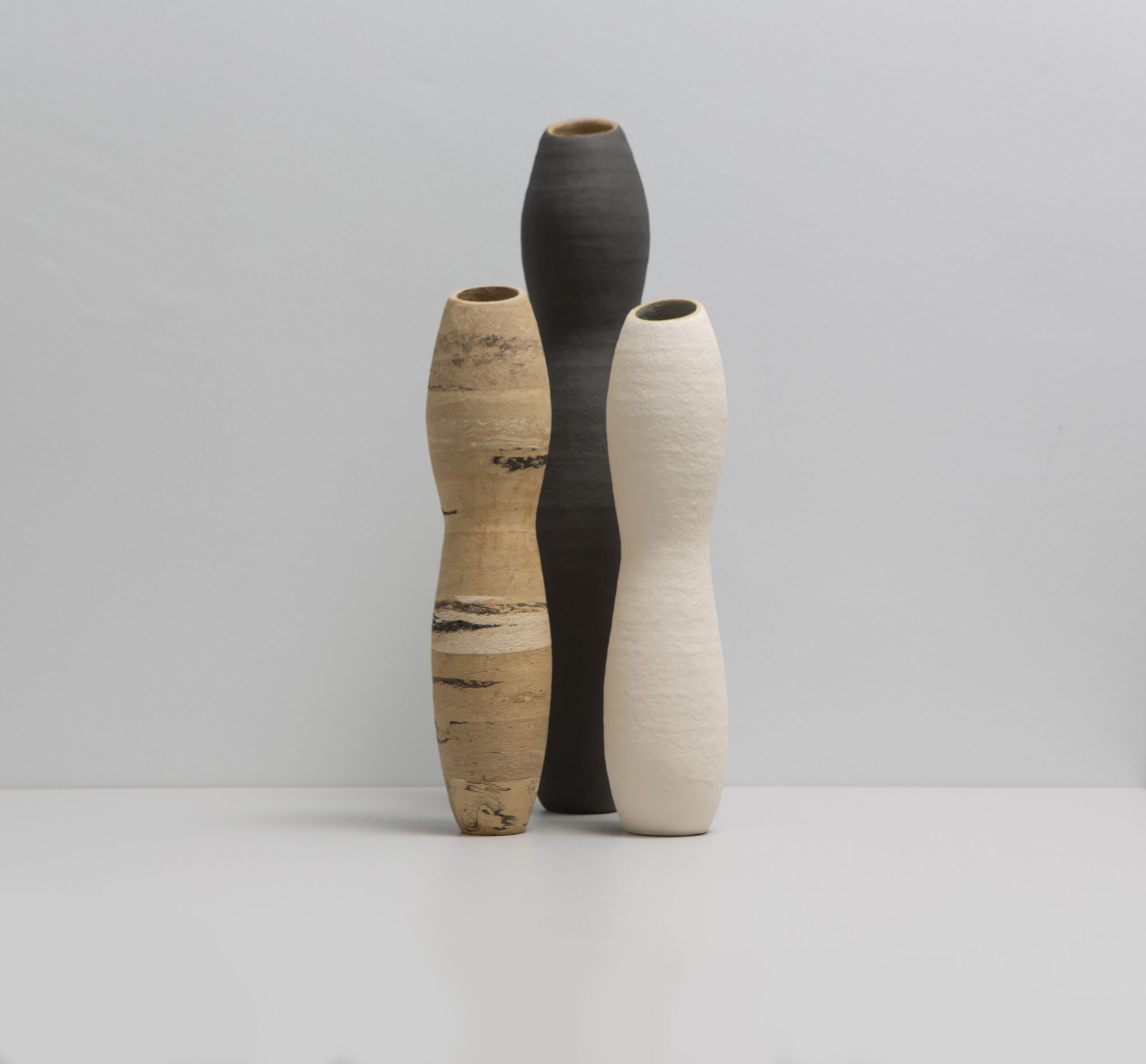
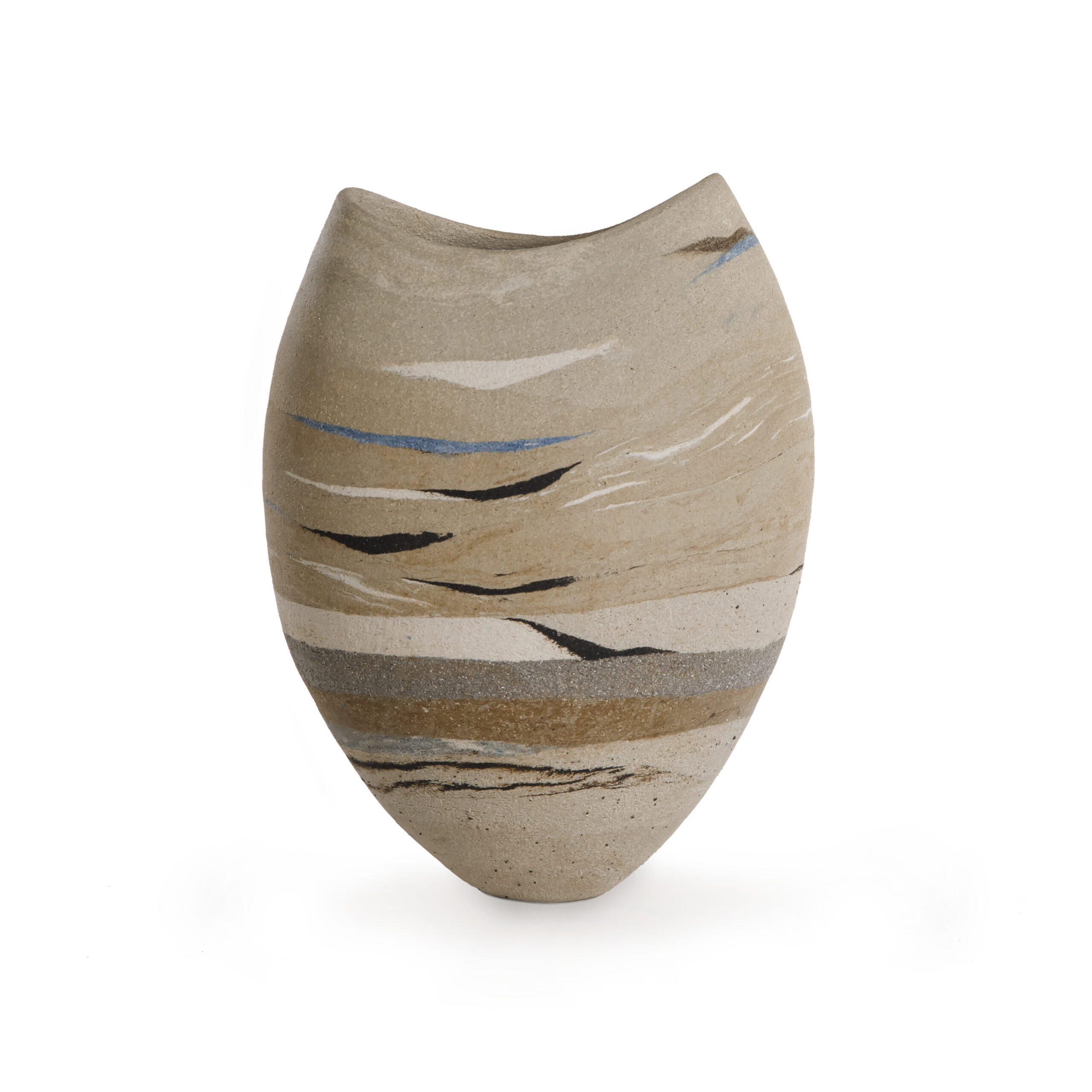
Judith Glover, 2019-20, Morandi-inspired Trio
References:
Gombrich, E (1960) Art and Illusion, Phaidon
Güse, E-G and Morat, F A (2008) Giorgio Morandi, Munich and London: Prestel Verlag
Judith Glover, North Yorkshire, October 19 and December 13 2021
Blog no 2 October 2021: Inspired by …
Joan Eardley (1921-1963)
In my presentation to the University of Dundee College of Art (DJCAD) 2021 online symposium to commemorate the centenary of Joan Eardley’s birth I tried to identify the point at which I realised that my pieces in my Seascape Series were responding in some way to Eardley’s seascape paintings. It was not, I explained, that on seeing her work in Glasgow some years ago I thought I could reproduce the look or even the feel of her work in ceramics. After all at that time I was still doing my day job and making pots was still just a hobby. In my 2021 talk I ventured the possibility that traces might be left in the memory, or rather more metaphorically that the brain has a front and a back burner and that I had stored her seascapes in the back burner area, ready to be moved forward in reaction to a stimulus of some kind.PThat stimulus came in 2020 when interviewing Yorkshire-based Scottish painter Lesley Birch for the Friends of York Art Gallery Q&A series that I organise. Birch, who also paints seascapes, mentioned Eardley as an influence, and this prompted me to revisit her work. I felt a particular connection with Breaking Wave (1960, ©Estate of Joan Eardley, accessed on artuk.org March 10 2020). It was at that time that I was experimenting with incorporating strata of clays of different tones and textures into a base clay. The technique is explored in Blog 3.
It was a small step to change my base clay from a rather smooth biscuit-coloured one (a Derbyshire/Shropshire mix) to a more sombre and highly textured grey Rokk, as in Seascape12_2021 below.
Glover, J (2021) Seascape12_2021, H 26 cms, coilbuilt with incorporated strata. Private collection
Perhaps it is not a case of being ‘influenced by’ but rather ‘responding to’. That brings me back to the idea of ‘traces’ left behind in the memory. I think it is Eardley’s curving of the upper edge of waves that I have responded to particularly. When I build a piece I think of the sea almost always as a concave line. There is also the feeling that Eardley’s seascapes produce: they are sombre, unsettled, beautiful, but dangerous. She generally liked to paint stormy seas and indeed when the inhabitants of Catterline, a small coastal village south of Aberdeen, knew that a storm was in the offing, they would phone her Glasgow studio to tell her to come to the coast. She would take the train to Stonehaven, the closest train station, and then complete the journey to the village on her Lambretta scooter.
An interview in The Scotsman in the early 1960s that I saw on display whilst visiting the Eardley exhibition at Modern One in Edinburgh in October 2021 suggested that it was difficult to get her to talk about her work. Going back to Watt’s idea of being in dialogue with an artist, I think I might have ended up discussing Lambrettas with Eardley. The point about Lambrettas was that my father, an English marine biologist exiled to Edinburgh in the 1950s and 60s, also had one. Occasionally I would ride pillion; it was daring (and smelly from the exhaust fumes).
I have realised that my father must have been working on the north-east coast of Scotland at the same time as Eardley was painting there – the late 1950s and early 1960s. He was working on a research project that involved going out with the herring fleet from Fraserburgh and Peterhead. In the safety of an Edinburgh suburb, he would announce that he was going away ‘to sea’, sometimes for weeks. I now know he would have encountered the wild and unforgiving seas that Eardley depicted from the shore of Catterline. As a small child I probably thought he would be sailing on a calm and fun-filled mill-pond of the sort that I was used to paddling in whilst on seaside holidays. Many decades on I realise that was unlikely.
I don’t know whether Eardley and my father would have had much in common. Eardley seemingly liked being beside the sea, but not on it. My father did not suffer from sea sickness, and he seemed to relish the pubs and ‘white pudding suppers’ of the bright lights on the coast further north towards Aberdeen. The tiny village of Catterline might not have ticked his box.
So in conclusion it is difficult to pin down the process of how and when one artist influences another who is working in a different medium. It is not as if I am working with a print of Breaking Wave, or another of Eardley’s seascapes, at my side. It is rather that I have an image in my head of a curving line, and/or a feeling that has been provoked in me – and the line and the feeling have, I suppose, lodged themselves in my imagination and reveal themselves in my work.
Judith Glover, North Yorkshire, October 20 2021
Blog no 3 November 2021: Strata
In a couple of my ‘Inspired by Morandi’ vessels, and in my Landscape/Seascape series inspired by Eardley’s Catterline work, I have used what I call a ‘strata’ technique.
Using the technique of coiling, I incorporate bands of different clays into the clay body. The colour palate is limited to what I see as earth colours – greys, white, charcoal, spice. There is also the occasional glimpse of blue, something that I mention on the About page. Shorescape1, below, is an example from 2022.
It has been suggested to me that the well-established technique of incorporating oxides (referred to as stains in the USA) into the clay body would achieve the painterly quality I am seeking. And that this would also incur considerably less in the way of risk because the shrinkage rates at the drying and firing stages would be constant throughout the piece. But I want to integrate the coloured strata into the actual structure of the body, so that they are visible and present in both external and internal faces. As Andreae (1991) says when writing about Loewe Prizewinner Jennifer Lee’s work ‘these seams of color are both surface and body…. they link the inner and outer surfaces of the pot’s walls.’
There is also a point about texture. I particularly want to incorporate different textures, since being able to hold and touch the fired unglazed clay is for me an integral part of the piece.
The key technical point, though, is that the clays that I juxtapose have different shrinkage rates at both the drying and the firing stages. So cracks between the strata are quite likely as one clay pulls against the other. Drying a piece very slowly may help reduce the failure rate, but when my ‘strata’ pieces go into the kiln, to be subjected to over twenty-four hours of temperatures culminating in 1220 degrees C, they are at risk of not emerging intact. Surprisingly, there are rather few casualties.
The renowned ceramic artist Ewen Henderson (1934-2000) is an obvious person to think about when considering juxtaposing different clays. Henderson was intrigued by rock formations and geology, particularly of Wales (De Waal, 2011) and he created pieces that incorporated terracotta, porcelain, bone china, paper. He actively wanted to take advantage of the different shrinkage rates of the clays that he juxtaposed; knowing that the clays would react differently in the kiln was part of the process. The holes and fissures that opened up were part of the piece. This is demonstrated in, for example, Upright Form (1988, www. anthonyshawcollection.org, accessed November 27 2021). I imagine its juxtaposition of different materials was regarded at the time of making with rather more than politely raised eyebrows, but now his work is very highly regarded. There are many examples in York Art Gallery in the Anthony Shaw collection.
However, early work of Henderson’s that incorporated different clays is rather more conventional. For example a 1979 piece in the V&A collection, Vase, featured in Watson (1993: 109), is described in the museum’s catalogue as ‘stoneware and porcelain, handbuilt from coloured clays’. It has a smooth surface and appears to have been worked on prior to firing. It can hardly be described as ‘patchworked’ in the way that Henderson’s later work could be, and which Upright Form is an example of.
In conclusion, I believe that my ‘strata’ work (see for example Shorescape 1 2022 below) could be seen as rather similar to Henderson’s early pieces, but it has less of a connection with his later work. For me having differing shrinkage rates is a technical problem I want to solve.
 Judith Glover, 2022, Shorescape1, H 26 cms, coilbuilt, incorporated strata. Private collection
Much of the final work on my pieces prior to firing involves lengthy smoothing by scraping with a metal kidney. This painstaking and time-consuming finishing process is sometimes quite thrilling, as strata that had somehow disappeared during the coiling process reveal themselves. Perhaps strangely I am reminded of the books that my mother used to buy at the nearby post office in the 1950s when I was in bed with some childhood illness: although they were apparently composed of blank pages the brushing on of water revealed an image below. It seemed like magic, and so sometimes do the finishing stages of my ceramics work, over sixty years on.
References
Andreae, C (1991) ‘Graceful, Tilting Contours of Clay’, www.jenniferlee.co.uk , accessed on November 20 2021
De Waal, E (2011) The Pot Book, Phaidon Press
Watson, O (1993) Studio Pottery, Phaidon Press
Whiting, D (2003), ‘The Circumnavigation of Form’, www.jenniferlee.co.uk , accessed on November 15 2021
Judith Glover, North Yorkshire, November 28 2021
Blog no 4 May 2023: Being unorthodox? Post-firing Painting
This piece appeared in June 2023 issue of Northern Potters Association News, pp 14-15
In some children’s craft kits the instructions are to use acrylics to decorate already-fired pieces. To my knowledge this is quite a rare incidence of post-firing decoration involving paints. It is not unknown though: for example De Waal (2011) highlights the American ceramic artist Ken Price (1935-2017) and his use of car paint, lacquer, and acrylics on his fired ceramic pieces, acrylics also being favoured by Nicolas Rena (1963-), along with wax.
My post-firing use of watercolours and pastels – the subject of this blog – may be more unorthodox, though. I am producing unglazed pieces that have been handbuilt (coiled) using a medium-grogged stoneware clay, prior to firing to 1220 degrees C.
After firing, in a phase of mark-making on the surface of the piece, I use heavily diluted watercolours in the restricted pallet that I often favour: charcoal, cream, burnt umber and a splash of Wedgwood blue (a Mason’s stain mixed into a white clay).
Working in layers and with a broad domestic paint-brush barely loaded with watercolour, I trace a curving motion that reflects the aperture and the form of the piece as a whole. I also use a small roller, the kind that enables domestic painters to get behind radiators. Again that is pretty dry, revealing the texture from the roller’s surface (this reminds me of Gerhard Richter’s abstraktes bilder where he used a squeegee). Over several days I add one or two more layers, bringing the piece into my living-room table and away from my studio space. In that way I can see it as I pass to and fro, and it remains in my consciousness.
The result? Sometimes it becomes a blurry mess but other times the spaces between the layers reveal something extraordinary – light bursting through, a piece of sky, an element of a seascape, a rockface.
But you need to know where to stop.
It is then that I turn to pastels. Without much pre-planning I run the side of a pastel crayon – black, grey, ochre, white – across parts of the surface, creating a sharp final layer over the water-colours. The pastels catch the joins between the flattened coils, revealing the details of the making process. I welcome this: for me the ‘how’ of a piece is as important as the ‘what’; I believe some museums and galleries underestimate the extent to which visitors are intrigued by the process of making. Perhaps the TV programme The Great Pottery Throwdown has played some part in developing this interest.
The last thing is sealing the surface with a transparent water-based varnish – the kind that is available in hardware stores for internal wood use. For the first couple of varnish layers I use a matt finish, and the final coat is satin, giving a muted bloom to the work.
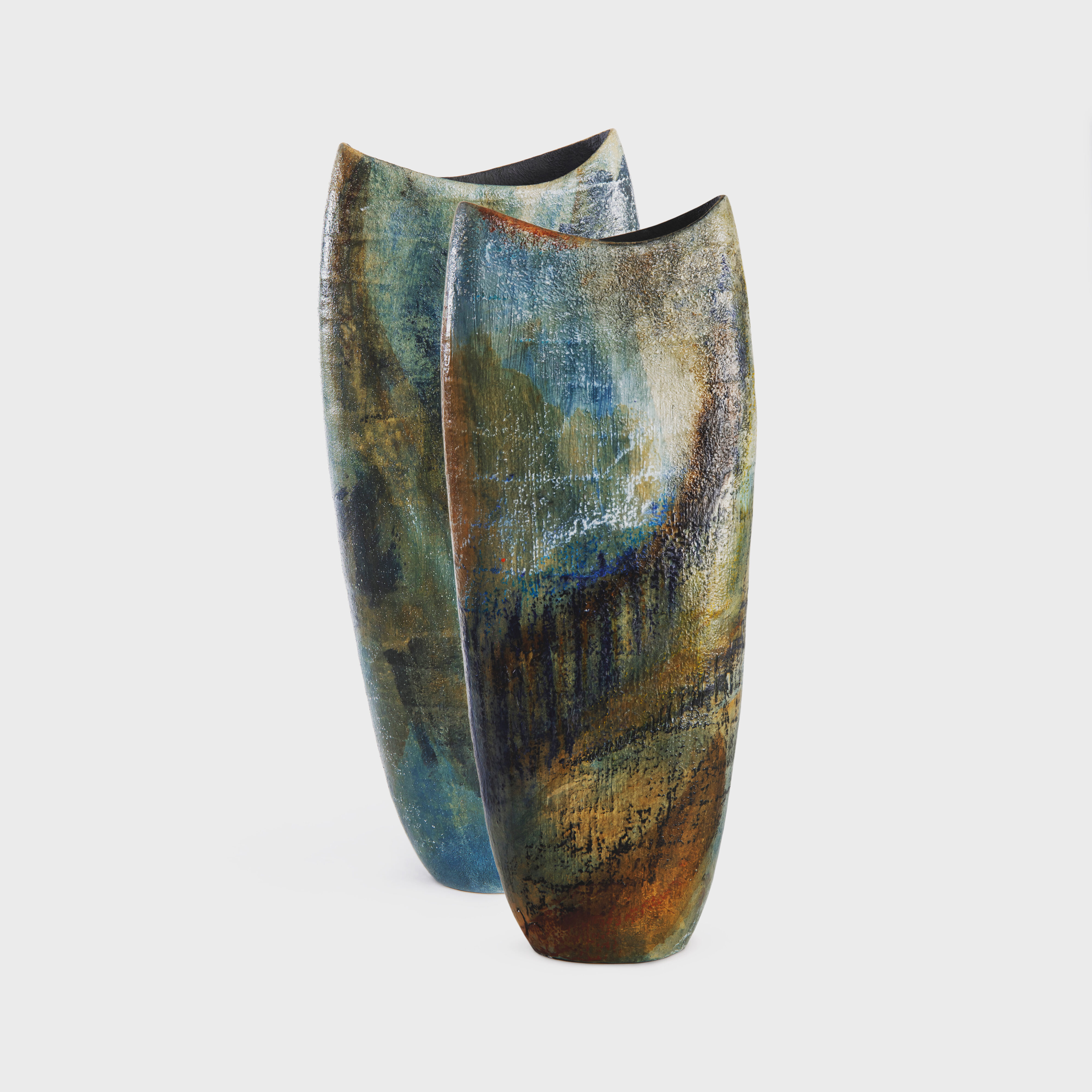
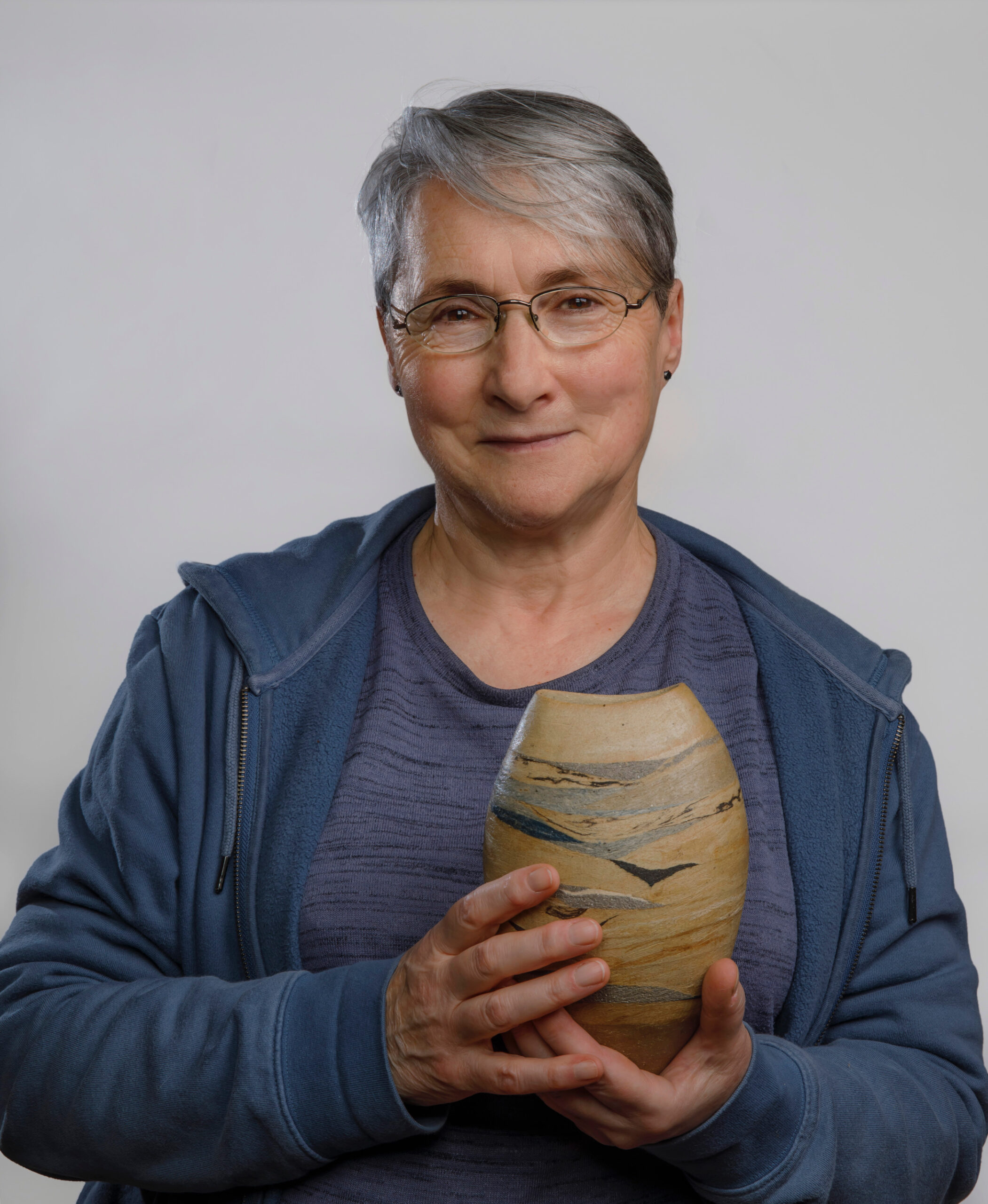
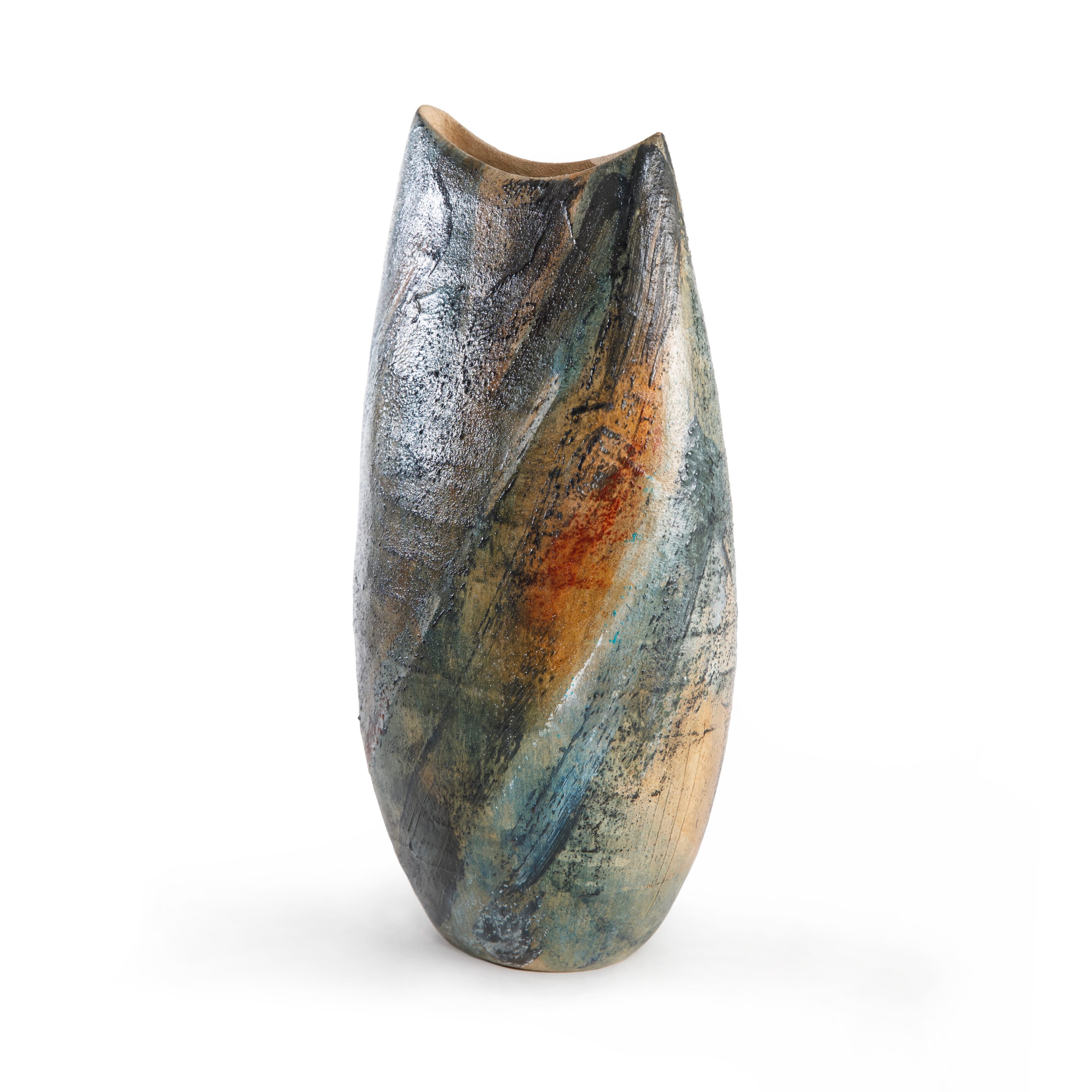
Below is Landscape_Lines1, created using this method. It is great to have found a professional photographer interested in discussing the work they are shooting. York-based Gareth Buddo and I both felt drawn to the pale blue and faint yellows of the space that emerged between watercolour layers on the right of the piece.
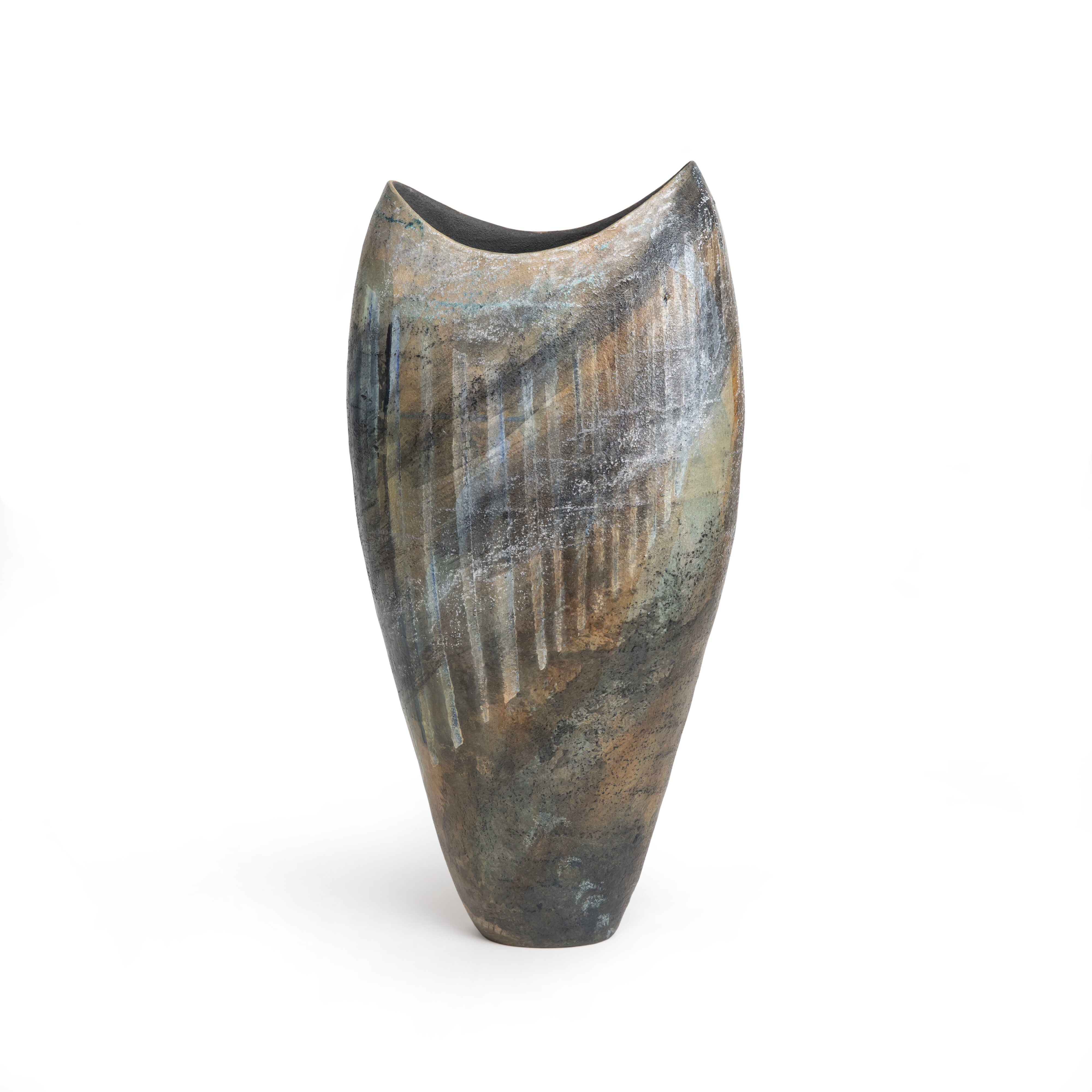
Judith Glover (2022) Landscape_Lines1. H: 38 cms, coilbuilt, post-firing watercolours, pastels, varnish. Private collection
Often my ceramics work is inspired by painters. Below is a duo, one element of which links in my mind to the seascapes of JMW Turner (1775-1851), and the other to John Piper (1903-1992), specifically in Great Goxhill 1947, a recent addition to the excellent University of Hull collection.
Judith Glover (2023) Duo_ Inspired by Turner and Piper. H: 30, W: 12, D: 4 cms, stoneware, coiled. Post-firing watercolours, pastels, water-based varnish. Private collection
I have no formal training as a ceramic artist but at least I can claim decades of adult evening pottery classes. As a painter I have no training. The astonishing thing is how free I feel as I apply the watercolours and the pastels. It has occurred to me (and some will be shocked by this) that it is precisely my lack of formal training that gives me this freedom. Thus I may break custom and practice, on the basis that I don’t know, or choose to ignore, any conventions that might exist.
Before becoming an impassioned ceramic artist post-retirement I was an academic sociologist. We liked to classify anything that was classifiable, and my painting-on-ceramics approach would probably have been defined as ‘post-modern’: n’importe quoi, some might say. Perhaps, though, I am just ignorant of many readers’ use of watercolours, pastels and water-based varnish on fired work, and I hope they will tell me if this is the case.
References
De Waal, E (2011) The Pot Book, Phaidon
Judith Glover, North Yorkshire, May 29 2023
Blog No 5: December 2023
This piece appeared in Claycraft magazine, Dec 2023, Issue 82, pp34-6
Outsiders: Going Against the Grain
At a recent meeting of artists accepted for the 2024 Open Studios in my locality the usual questions (‘how do I send you a video’, ‘what is the deadline for my cv’) were interrupted by a disturbance: a group of applicants who had not been accepted had turned up, and wanted to know why. The organisers – all volunteers – were taken aback. They didn’t explicitly say so, but this meeting was for the accepted, not the not-accepted. The selection policy was defended in a variety of plausible ways, and the meeting moved on to more mundane issues – signage, parking, marketing and so forth.
This incident got me thinking that those who felt understandably upset about being excluded could have decided that a salon des refusés was the answer. After all, being outside the club served the Impressionists well; going against the grain turned out to be a key factor in their subsequent worldwide fame.
In another life, one that was much less interesting than my current one as a ceramic artist, I earned my living as an academic sociologist. In sociological literature the term ‘social closure’ describes the way in which those who are inside the club tend to safeguard their boundaries, excluding those who are seen in various ways as unsuitable, one being a lack of qualifications. This is obvious for medics (thank goodness) but less so for artists. In my case I haven’t any kind of formal artistic qualification and it has always surprised me that I have managed to find my way through some boundaries. Being accepted for Open Studios may seem minimal, but you can hardly believe your luck if you haven’t any credentials other than a couple of decades of pottery evening classes.
It has occurred to me that being mostly on the wrong side of the tracks may have stood me, in my new post-retirement guise as a ceramic artist, in good stead. Why? Because it gives me freedom. I have little idea what is expected, or more accurately choose to ignore any expectations. For example, it is possibly shocking that I have no idea how to throw pots on the wheel. My one unsuccessful attempt gave me a stress headache and was never repeated – pottery evening classes were meant to take me away from the academic world, not give me a sore head. Rather more valiantly (unlike the wheel I did keep on trying) I have tackled glazing, but I concluded that many pieces were spoiled by poor technique. Those drips! Those smudgy colours! Those bubbles! Now my work is always unglazed.
So what is my technique now, in the ten or so years since leaving the world of the university? I have adopted the practices of African women centuries ago, and more recently seen in craft classes for small children: I produce handbuilt coiled pieces. Nothing unorthodox about that. I probably work more slowly than most – about three hours each day when the natural light is right (in summer this tends to be in the afternoon, in winter in the morning). Some days I don’t add anything, but instead spend the time preparing the work for the next coil (only ever one at a time). Just as important as the adding of clay is the preparation of the existing surface, both inside and out, to produce a smooth and stable form that will serve as a foundation for the next addition. The result is that each piece takes around six weeks from start to finish and my annual output is only around fifteen pieces. And then, always, there is music. Brahms usually works better for me than Schoenberg; Philip Glass mesmerises. I’m told by someone who writes software programs that it’s called getting into the zone.
I often want to bridge painting and ceramics. Some years ago I saw the work of the Italian artist Georgio Morandi in the Bologna Museum of Modern Art MAMbo; as I gazed I wondered if I could reproduce the feel of his still life painting in ceramics. Back home I developed a series called ‘Inspired by… Morandi’, making trios of tall waisted coiled vessels in the earth tones that Morandi almost always used. Just a plain matt surface in coloured slip, with a contrasting tone on the largely invisible interior. Then I encouraged potential buyers to create their own trio from a selection that I made available to them. I felt this involved them in the creative process and allowed them to think about where the chosen ensemble might be placed in their homes. This provoked a comment of ‘lacking artistic integrity’ from an artist with impeccable formal credentials in ceramics. The artist should decide, they said, not those who bought the work. I disagreed. The conversation with the putative buyers was a source of creative pleasure for me, and hopefully for them.
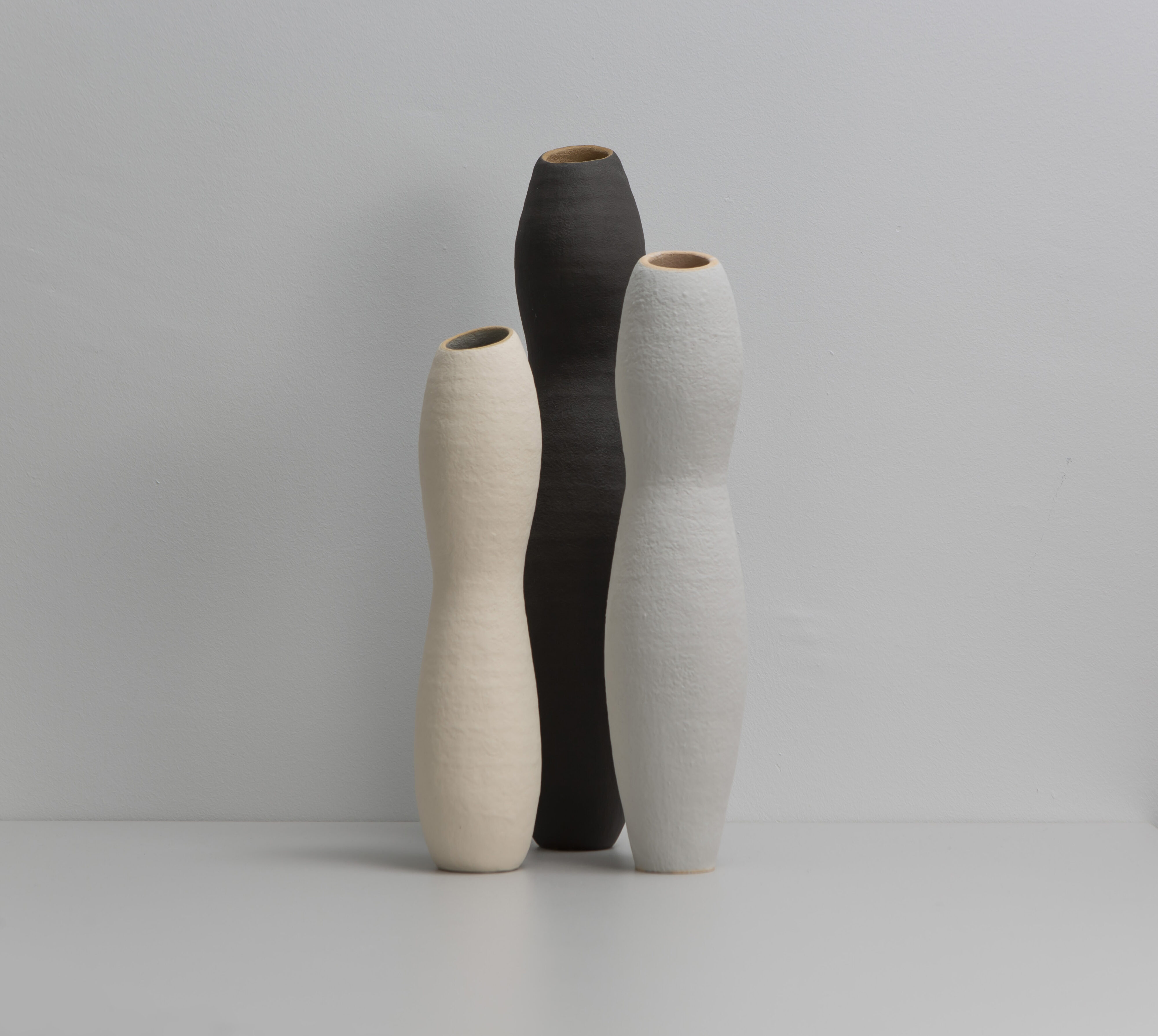
Judith Glover (2018) Morandi-inspired Trio, handbuilt stoneware, coloured slip, H 36 – 28 cms
I was, and still am, strongly drawn to the largely abstract seascape painting of Joan Eardley (1921-1963). I remember standing for a good half-hour in front of a work of hers that took up one whole wall of a room in the Edinburgh gallery Modern One. As with Morandi I wondered if I could develop ceramic pieces that reflected her paintings – not in a literal sense, but rather to somehow create the feeling that her work provoked in me. I have made several pieces in this series, but Inspired by…Eardley: Seascape12 (2021) is probably the most successful in giving me a sense of looking out to sea beyond beach, strand and shore.
 |
 |
Judith Glover (2021) Inspired by… Eardley: Seascape12, reverse side detail, stoneware, H 26 cms, private collection
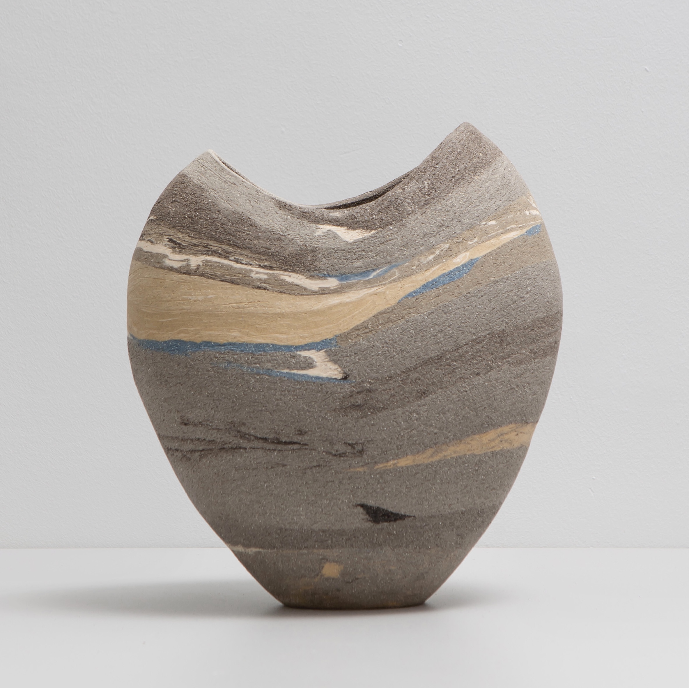
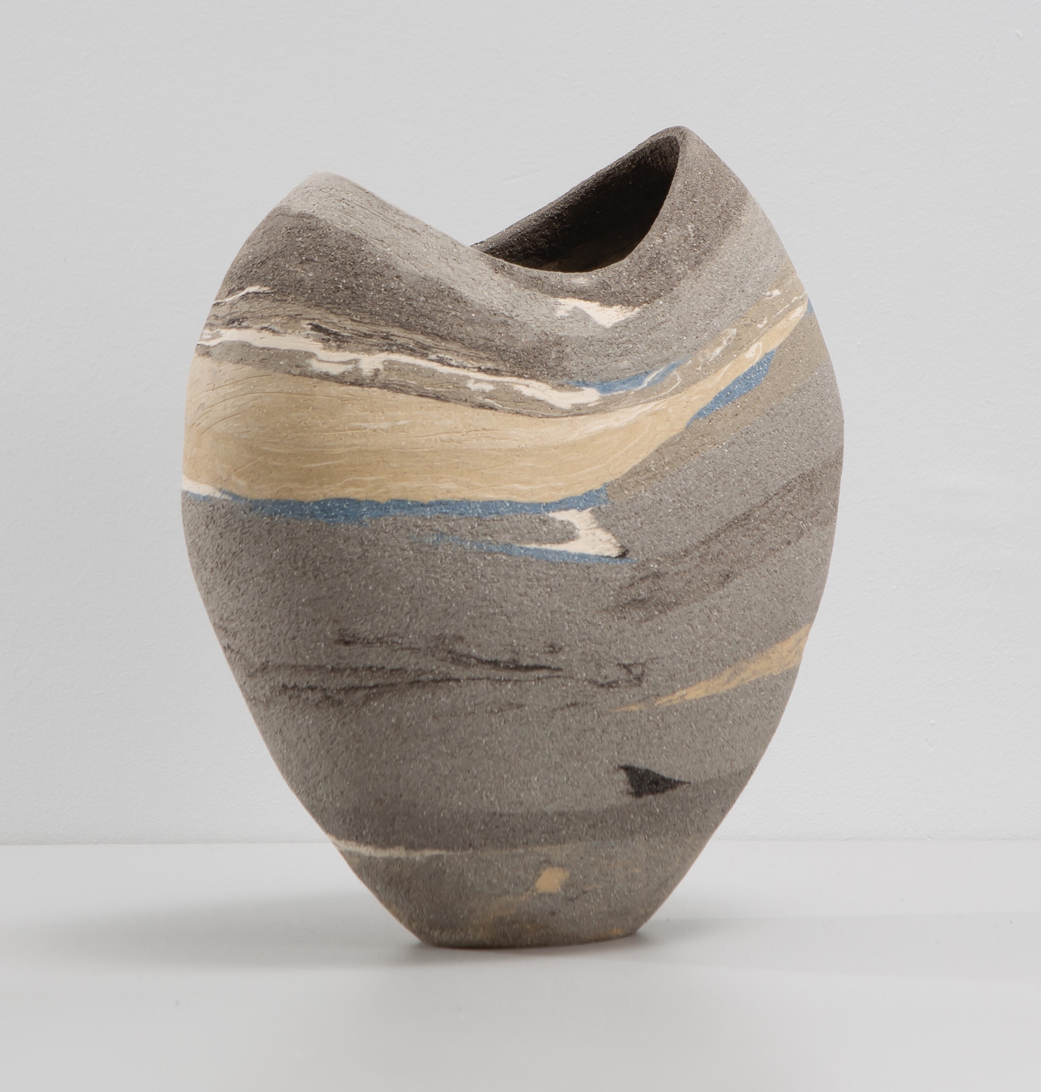
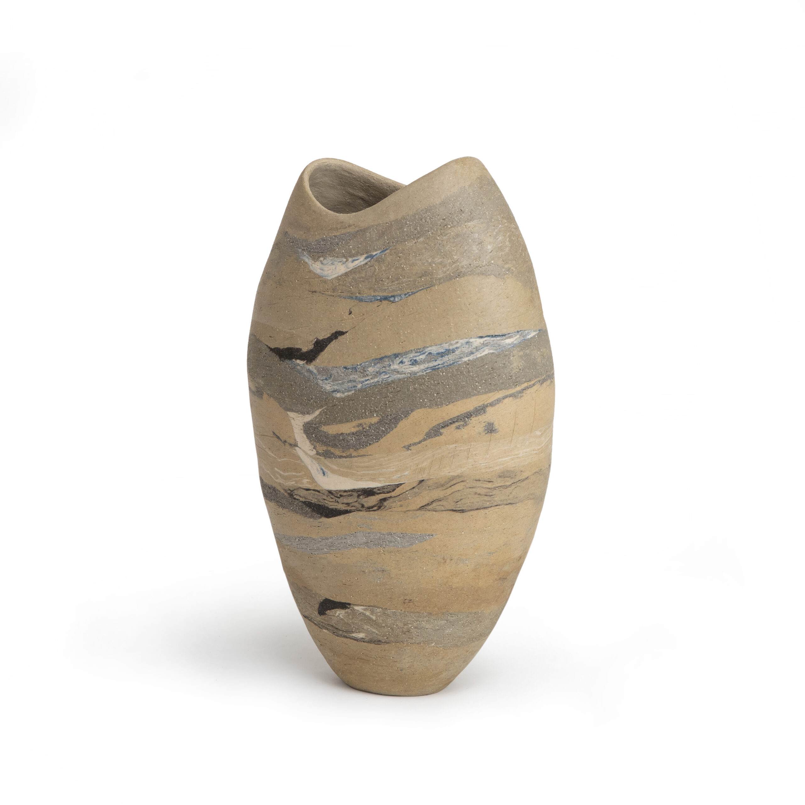
Building Seascape12 involved the incorporation of strata – coils of clay with different tones and textures – as I gradually created the piece in a highly grogged grey ‘Rokk’ base clay. It was produced in the dark days of the global Covid-19 pandemic; I felt that the flashes of blue were symbolic of hope that the world would finally emerge. Eardley also introduced areas of blue into her seascape painting, and I have often wondered what that tone represented for her. Maybe also hope, maybe something else entirely.
But why go to all this bother? Wouldn’t oxides and/or glazes do just as well? After all in that way I would finally learn (about time too!) how to glaze. Why make problems for myself when armies of ceramic artists had already established a solution? This was, of course, suggested to me. My answer was that I wanted to incorporate clays that felt different to the touch – some smooth, others a lot less so. Texture seemed crucial, much as I think it was for Eardley in her seascapes. And given that this was to be an unglazed piece (for me what else?) the different strata would be felt by those who were handling the piece and maybe thinking of acquiring it.
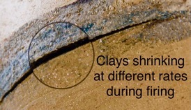
But this is a tricky approach, primarily because each type of clay has a different shrinkage rate, both in drying and firing. For example the Rokk clay shrinks less than the Shropshire-Derbyshire mix. The risk is that each pulls against the other. Twenty-four hours at 1220 degrees C is, to put it mildly, a challenge for this ‘strata method’, as I came to call it.
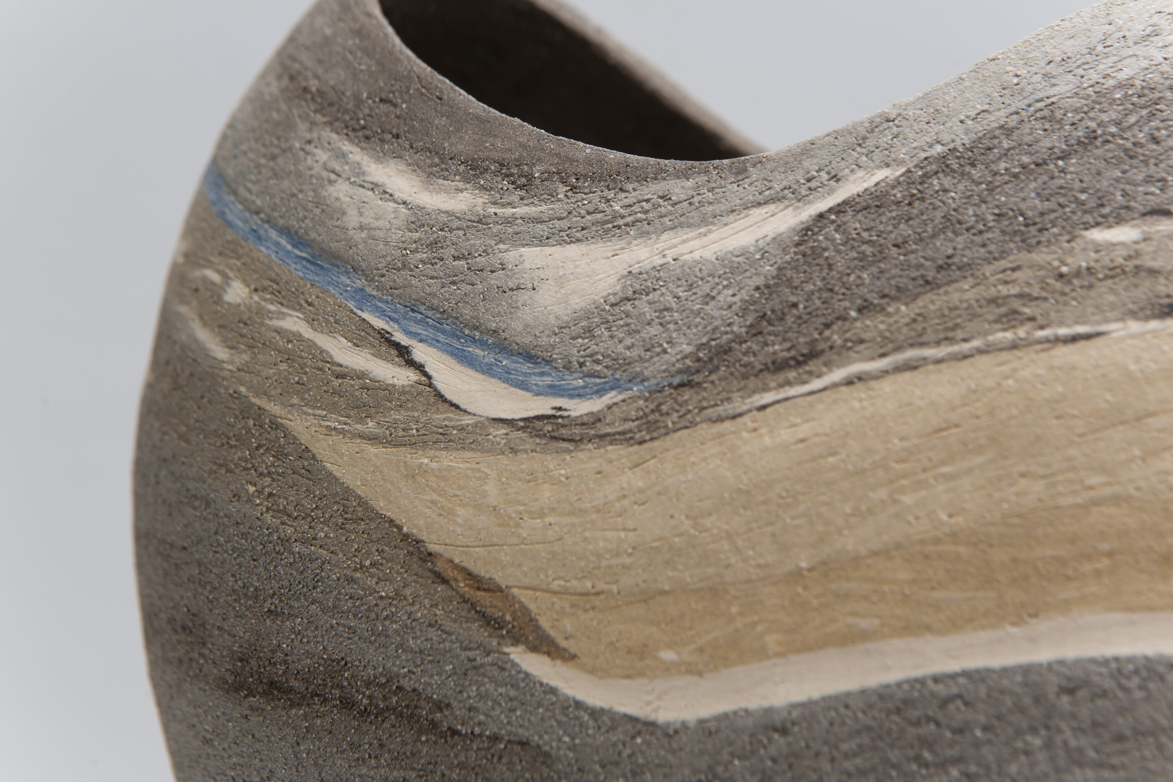
In a magnified detail from a 2023 piece produced in this way, we can see how the shrinkage rates have been impacted by the firing process. The biscuit-coloured Derbyshire-Shropshire mix has detached itself from the grey ‘Rokk’ clay, which I had mixed with a blue stain – and for all I know this addition may also have contributed to the strata pulling away from one another.
The history of ceramics tells us of artists who value the crevices and cracks that firing can bring out when different clays are combined. For example Ewen Henderson (1934-2000) deliberately aimed for this result; I suspect he would have despaired at the smoothness that I spend hours, days and sometimes weeks trying to produce with a metal kidney. I should admit that I very much like this stage of the process – the scraping of the leather-hard surface often results in tones and textures revealing themselves, almost by magic. The mesmeric quality of Philip Glass’s music comes in handy at this stage.
Most of the time, though, the work emerges crack-free from the kiln. One reason may be that I dry my work over a period of around two weeks. Slow drying seems particularly important; rather whimsically I imagine that the different clays are taking time to become accustomed to their new neighbours. More prosaically I suspect that the varying moisture contents of the different clays are gradually standardising – and this may be a major factor in reducing the likelihood of cracks and fissures.
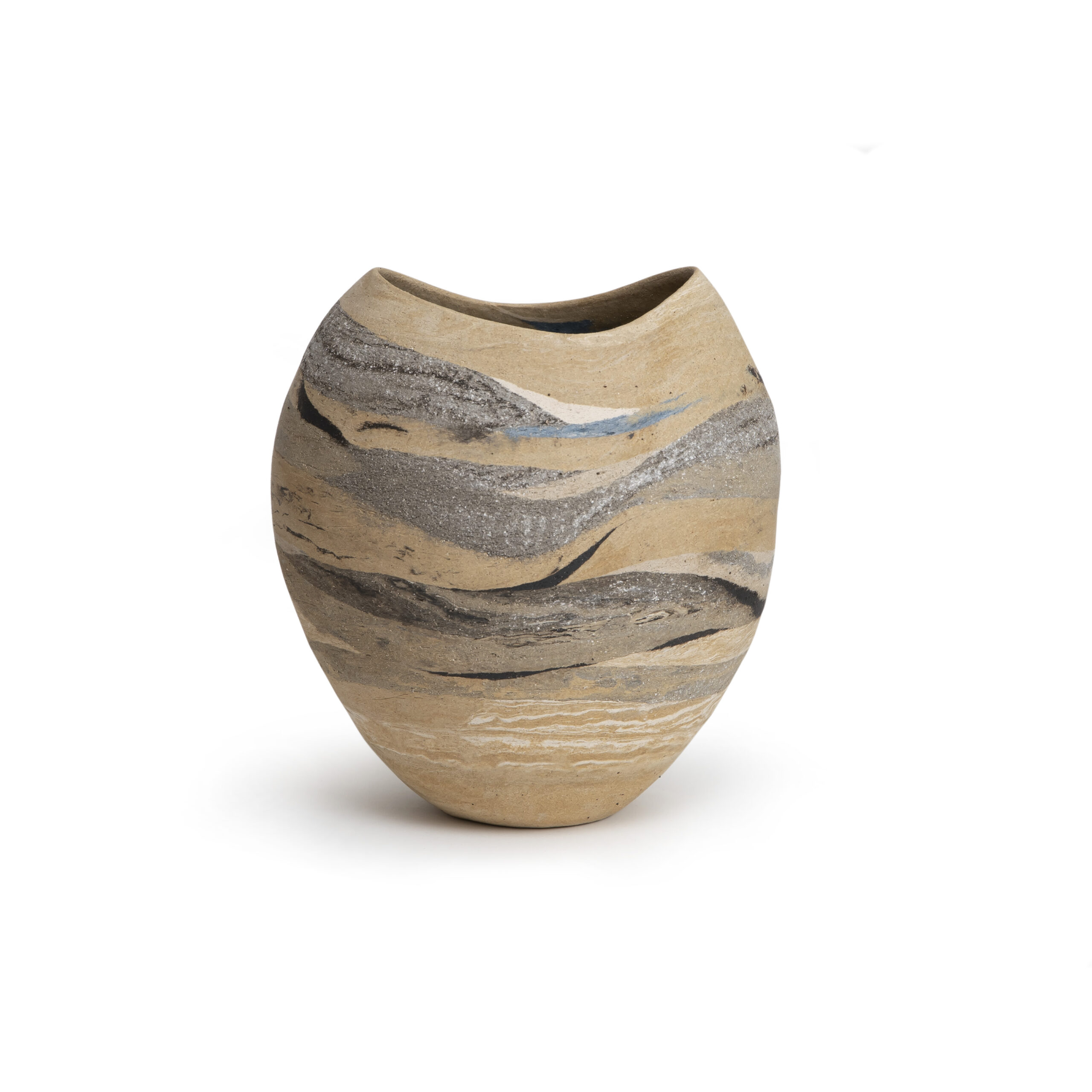
Judith Glover (2022) Inspired by… Eardley: Beachscape1, coilbuilt stoneware, H 25 cms, private collection
Beachscape1 shows the Derbyshire-Shropshire mix used as the base clay into which the different strata are incorporated. The eagle-eyed will detect that the right-hand line has slight indentations where the base clay, roughly mixed with a small amount of a non-grogged plastic white clay, has shrunk rather more than the strata above and below it. This, I assume, is at least partly due to different shrinkage rates during firing. Also, above the grey band of Rokk clay, the biscuit-coloured Derbyshire-Shropshire mix has slightly indented.
But, hey, these are handbuilt sculptural pieces, constructed in the studio pottery tradition and very far from functional production pottery. The proverbial man on a galloping horse wouldn’t notice – maternal words of advice from the past that have served me well. In other words perfectionism is not necessarily the aim. I have concluded that being a ceramic artist means trying to do one’s very best, but a perfect outcome is pretty unlikely if unusual technical approaches are attempted.
In the meantime the bending of rules, conventions and opinions is a great adventure. Bring on the salon des refusés! Go against the grain! Being an outsider, or even the semi-outsider that I may have become, might be uncomfortable at times, but it can be a source of strength and might, just might, result in something of interest.
Claycraft magazine, Dec 2023, pp 34-6
Blog No 6: March 2025
This article appeared in Yorkshire Life, March 2025, an issue that celebrated International Women’s Day
Second time round
Second time round for older women seems to be a theme nationally and regionally – and a particularly appropriate way to celebrate International Women’s Day. For example Elizabeth Llewellyn, now in her fifties, moved from an IT career to become a widely acclaimed opera singer on a world stage. And more locally the 2024 Yorkshire Sculpture Park exhibition ‘Actually I Can’ celebrated Carol Douglas becoming a painter in her seventies.
My second time round involved leaving university teaching in London and becoming a York-based ceramic artist. For decades pottery had been a hobby, developed in adult education evening classes, but on retirement it has become a passion. Now age seventy-five I have exhibited in several Yorkshire galleries, the Leeds Craft Centre and Design Gallery, and the York clothes store Jigsaw. I have taken part in York Open Studios for four years, the fifth coming up in April 2025.
My focus is handbuilt sculptural ceramics, using the age-old method of coiling. One strand of my work is the creation of trios of tall vessels in earth tones, inspired by Italian still-life painter Giorgio Morandi (1890-1964).
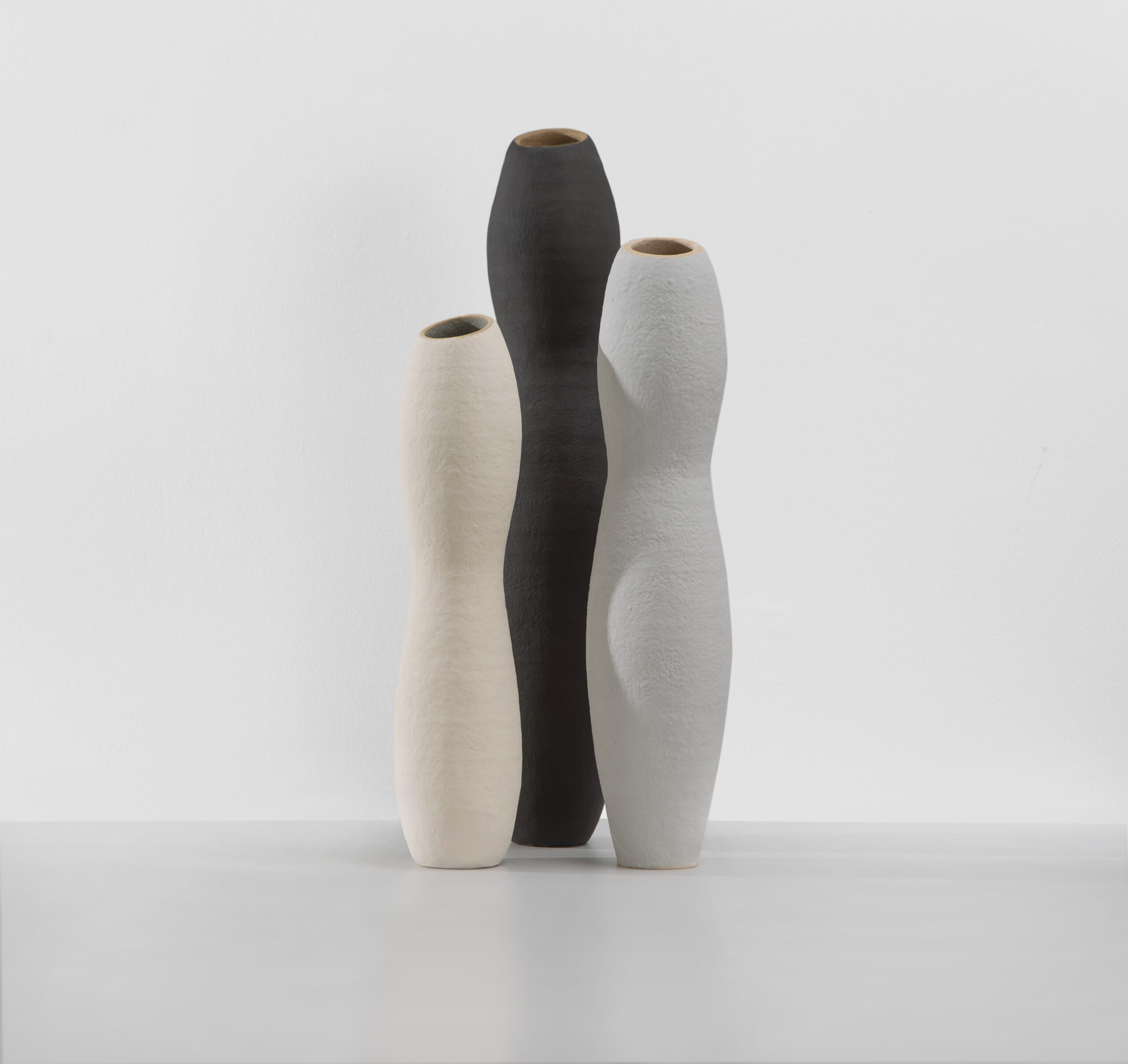
Morandi-inspired Trio, height 28-34 cms, 2019-21
I encourage potential buyers to construct their own trio, thinking about where it might be placed in their homes, and how it might fit into their overall vision of home. Recently I visited Norway and was struck by the importance attached to the design of living spaces, especially important during their dark winters. Having said that I do recognise that homes are not always places of comfort and welcome, which is why I donate proceeds from my ceramics sales to the Yorkshire charity IDAS, which supports those who are affected by domestic violence.
The seascapes of Scottish painter Joan Eardley (1921-1963) are also an inspiration. On a base of a biscuit-coloured clay from Derbyshire and Shropshire, I use clays of different textures and tones to create layers. Technically this is tricky as the different clays shrink at varying rates whilst being fired. I have worked out that a slow drying phase helps produce work that is intact when the kiln is opened at the end of a firing – a potentially stressful moment! Each piece takes about two months from start to finish, and as a result I only make about fifteen pieces each year, despite working on them most days.
Shorescape2, 2024, coilbuilt stoneware, incorporated strata, H 26 cms, private collection
Another inspiration for me is painter John Piper (1903-1992), primarily the rather abstract backgrounds to his paintings of churches and other buildings. There’s a 1948 painting of his in York Art Gallery that has particularly spoken to me – ‘Stair Hole, Lulworth’. I’ve developed a technique that conventionally trained ceramicists might well disapprove of, but it has been popular. Once a piece is fired I use watercolours and soft pastels on the surface, and then a matt water-based varnish as a sealant.
Inspired by Piper – Landscape 2023, H 26 cms, coilbuilt stoneware, post-firing watercolours, pastels and varnish. Private collection
I am very much looking forward to York Open Studios in April 2025, getting the chance to exhibit my work in Tim Pearce’s purpose-built painting and ceramics studio in Warthill. We typically welcome around two hundred visitors over the consecutive Open Studios weekends, and it is here that I fire my work after constructing it on my kitchen table back in York.
Many people who come to Open Studios say their interest in ceramics has come from the TV programme The Great Pottery Throwdown. It has played such an important role in moving ceramics into the home. And viewers of the programme know all about that heart-stopping moment when the kiln is opened!
Judith Glover, North Yorkshire, March 2025